Cooker Interface Redesign
So, you are doing interface design? How about designing user interface for my cooker? “Why?”—you ask. Well, the other day Luka’s grandma attempted to warm his bottle, but she had a problem guessing which switch-button is for which burner on our kitchen cooker…
When you use something every day, you now how it works and you don’t have to look at the symbols near some control, but when you face some interface for the first time (no matter how simple it is), it’s of a great help when there are adequate hints.
Current Cooker Interface
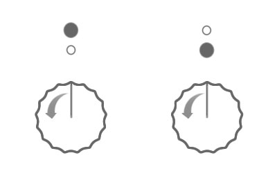
 It is cooker with just two burners—the larger is behind the smaller one.
See how symbols are confusing? It could be that the white one is the particular one, or vice-versa. I’ve added reddish arrows to show you direction of rotation for switching on.
Tasks
Here are your tasks:
- Download .PNG file to your disk.
- Create symbols which should come above each switcher (which are telling which switch-button is for which burner).
- Create symbols which should be on the switchers (which are telling in what direction one should rotate to increase flame on the burner).
- Show your example in the post, using
<img src="http://..." alt="" />tag with illustration hosted on your server. Images should be 400px wide (otherwise they will be stretched or shrinked).

11 Comments
What about this?

But I think it’s bit illogical due to the nature of alphabet and left-right way. I think the rotation should be other way round if trying to be more cooker-friendly. ;-)
Comment (#) by dusoft — 28th February 2005.
Sorry, i forgot to enable images : ) Now it’s fixed.
You’re right—it is a bit unnatural. For example, volume control on my stereo has positive action in clockwise direction.
Comment (#) by marko — 28th February 2005.
Here’s what I came up with:
The symbols above the switchers should make it clear… It’d be much easier if there were ie 4 burners, of course. This way, you must make it absolutely clear which is which - I’ve done that by making one symbol larger than the other.
The switchers IMO must have 2 things - a line, as I illustrated, which tells you exactly where the switcher is moved, and an arrow or any other symbol that clearly indicates in which direction you should move it.
My stove also has awful ‘user interface’. I’ve been using it for several years and still have to think what is where. Instead of making it more simple, they complicate it. Amazing.
It’d be great if the symbols were made in such way that you could feel them under your fingers, that would make them even more easy to use.
Comment (#) by bojan — 28th February 2005.
bojan: I somehow forgot about the line showing where the knob is turned. I should remember not working during late night….
Comment (#) by dusoft — 28th February 2005.
OK, brainstroming and adding another try:

Comment (#) by dusoft — 28th February 2005.
OK, here’s my go at this:
Since there are only two burners, and as you said, the larger is behind the smaller one, I think there’s no need to bring the confusion about which is which. Why not simply indicate the bigger one and the smaller one?
Add to that a simple “off indicator", and I think it should be quite usable : )

P.S.
The arrow icons are “stolen” from bojan’s version, hope he doesn’t mind : )
Comment (#) by zytzagoo — 28th February 2005.
OK, now the big thing: I have checked my stove (it is classic gas-stove with four burners) and remembered this: every stove must have this counter-clockwise knob since this is very important security measure.
Also that means that all the proposed design are lacking secure operation - you must have smaller flame down and not up, the top position must be zero, then followed by the quarter of emptiness (e.g. no gas) and then by the strongest flame slowly passing away to the bottom with the lowest flame possible (from 3 quarters left to bottom left). This guarantees that nobody could leave gas open when moving to ZERO position since the last quarter (top left quarter following the strongest flame) means gas is off.
Comment (#) by dusoft — 28th February 2005.
This experiment is cool. I just might print some stickers and put them on my stove :) Or better yet, print a bunch and make some money ;)
Seriously, this is one of those things that obviously hasn’t been given enough attention. Why on earth don’t they make it more simple? Another thing comes to mind, regarding ‘making it simple’. It’s those damn forms you have to fill out at the post office (here in Croatia), when sending packages. Those forms are so tough to understand if you’re filling them out for the first time! Tiny letters, tiny format design, enclear instructions… Keep it simple, for crying out loud!
@zyt: I thought it looked farmiliar :)
Comment (#) by bojan — 28th February 2005.
my stowe looks like this…
Comment (#) by emptyhead — 28th February 2005.
@zyt: I like arrows, but wait… aren’t those bojan’s? : )
@bojan: “Or better yet, print a bunch and make some money ;)”… and pay me percentage for the rest of our lives : )
@dusoft: Security measures are adding more thoughts to consider when designing this interface. So, perhaps this linear arrows are not enough?
@emti: You just can’t do anything seriously, don’t you? : )
Comment (#) by marko — 1st March 2005.
@marko: naaah, you’ve only made me think about it all a bit. Maybe I’ll mention you here or there.. Or somewhere :)
Comment (#) by bojan — 1st March 2005.
Sorry, the comment form is closed at this time, but if you have anything to say, please send me a message.